


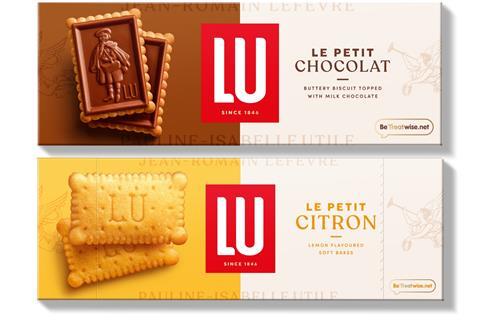
Mondelez-owned biscuit brand Lu has unveiled a “sophisticated” redesign to establish its premium positioning in the UK.
Packs now feature a centralised brand logo and “distinctive, bold, bright colours to differentiate each biscuit in the range and ensure strong standout on shelf”.
Each features product photography, along with the angel Pheme, taken from the French biscuit supplier’s heritage branding, to indicate “premium quality”.
Consumer feedback on the new design had been “extremely positive”, said Lu.
In-store messaging will read ‘New design, same beautiful biscuits’, to “help and reassure consumers”, it added.
This redesign will be unique to the UK market and seeks to target a more mature shopper than Lu’s core family market in France.
“This launch is more than just a design change, it’s an invitation to experience ‘Le Petit Pleasure’, bringing a touch of French elegance and delight to every Lu moment,” said Lu brand manager Kelly Lawrence.
“In a category where brands compete for similar moments of consumption, Lu aims to seize the opportunity to stand out,” she added.
Lu’s value sales rocketed by 32.8% to £28.2m in the year to 7 September 2024, on volumes up 12.5% [NIQ].
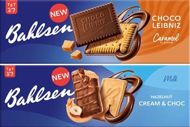
It comes after posh biscuits rival Bahlsen last week unveiled a “comprehensive brand relaunch”, moving away from differentiated pack designs and resurrecting its old blue branding.
If you’ve got a fantastic new product or packaging innovation, we want to hear about it! The entry deadline for The Grocer New Product & Packaging Awards is 9 June, so make sure to get your entries in. Visit this link to enter, buy tickets or enquire about sponsorship opportunities.


No comments yet